Barplot for Two Factors in R – Step-by-Step Tutorial
Barplot for Two Factors in R
Step-by-step tutorial to build publication-quality barplots
Rosane Rech
- Loading the appropriate libraries
- Loading and checking the data
- Basic plot
- Using colour to split the results
- Error bars
- Customising x and y titles
- Customising the theme and legend
- Adding the compact letter display
- Customising the y limits
- Adding text labels
- Cleaning unwanted information in the legend
- Customising colours
- Gray-scale
- Saving the final plot
- Related video tutorial
In this tutorial we are going to see how to build a high-quality barplot for two explanatory variables.
The data1 presents the results of an experiment conducted to study the influence of the operating temperature (100˚C, 125˚C and 150˚C) and three faceplate glass types (A, B and C) in the light output of an oscilloscope tube.
To build the barplots, we are going to use the summarised data, with the mean, the standard deviation and the letters indicating significant differences by Tukey’s test (compact letter display). You can download the csv file with the summarised data or you can follow the Two-Way ANOVA in R – Step-by-Step Tutorial to build it.
Loading the appropriate libraries
We are going to start by loading the appropriate libraries, the readr to load the data from a csv file and the ggplot2 for the plots.
# loading the appropriate libraries
library(readr)
library(ggplot2)
Loading and checking the data
The first step ot the analysis is to load and check the data file.
# loading and checking the data
data_summary <- read_csv("GTL_summary.csv")
print(data_summary)
## # A tibble: 9 x 5
## Glass Temp mean sd Tukey
## <chr> <dbl> <dbl> <dbl> <chr>
## 1 A 150 1386 6 a
## 2 B 150 1313 14.5 b
## 3 A 125 1087. 2.52 c
## 4 C 125 1055. 10.6 c
## 5 B 125 1035 35 c
## 6 C 150 887. 18.6 d
## 7 C 100 573. 26.5 e
## 8 A 100 573. 6.43 e
## 9 B 100 553 24.6 eWe can see that we have nine observations (rows) and five columns: Glass, Temp (factors), mean (response variable), sd (standard deviation), and the last column shows the compact letter display form Tukey’s test. Glass and Tukey are defined as character (chr), Temp, mean and sd are numeric variables (dbl).
The next sections show the step-by-step codes to build bar plots suitable for the presentation of this particular result.
Basic plot
We are going to use the function ggplot() to build the barplots. The first argument is the data file, data_summary, and the second argument is the aesthetics aes(), where we define the x and y variables, Temp and mean. However, if we run only this code, we will have a blank plot. We need also to define the geom, and is this case, geom_bar(stat = "identity") for the barplot.
# coloured barplot
ggplot(data_summary, aes(x = factor(Temp), y = mean)) +
  geom_bar(stat = "identity")
Using colour to split the results
To split the results by the glass type we need to define fill = Glass and color = Glass in the aesthetics of the ggplot() function.
# coloured barplot
ggplot(data_summary, aes(x = factor(Temp), y = mean, fill = Glass, colour = Glass)) +
  geom_bar(stat = "identity")
The default barplot from ggplot is with the stacked columns. To arrange them side-by-side we need to add the position = "dodge" argument to the geom_bar() function.
# coloured barplot
ggplot(data_summary, aes(x = factor(Temp), y = mean, fill = Glass, colour = Glass)) +
  geom_bar(stat = "identity", position = "dodge")
Error bars
Now that we have the bars arranged side-by-side, we can add the error bars using the geom_errorbar() function. The arguments are the lower and upper limits, ymin and ymax, that I have defined as the mean ± sd columns from the data_summary data set.
# coloured barplot
ggplot(data_summary, aes(x = factor(Temp), y = mean, fill = Glass, colour = Glass)) +
  geom_bar(stat = "identity", position = "dodge")  +
  geom_errorbar(aes(ymin=mean-sd, ymax=mean+sd))
We clearly have a problem, since all error bars are centered in each temperature. To correct it we need to define their position as position = position_dodge(0.9). They are also too wide, so we will define their width as 25% of the column width using the argument width = 0.25.
# coloured barplot
ggplot(data_summary, aes(x = factor(Temp), y = mean, fill = Glass, colour = Glass)) +
  geom_bar(stat = "identity", position = "dodge")  +
  geom_errorbar(aes(ymin=mean-sd, ymax=mean+sd), position = position_dodge(0.9), width = 0.25)
The error bars are associated to the argument colour = Glass in the first code line. As the error and the bars are the same colour, they are hard to distinguish. So I will apply a degree of transparency to the bars using alpha = 0.5 in the geom_bar() function.
# coloured barplot
ggplot(data_summary, aes(x = factor(Temp), y = mean, fill = Glass, colour = Glass)) +
  geom_bar(stat = "identity", position = "dodge", alpha = 0.5)  +
  geom_errorbar(aes(ymin=mean-sd, ymax=mean+sd), position = position_dodge(0.9), width = 0.25)
Customising x and y titles
Let’s now customise the x and y titles using the function labs().
# coloured barplot
ggplot(data_summary, aes(x = factor(Temp), y = mean, fill = Glass, colour = Glass)) +
  geom_bar(stat = "identity", position = "dodge", alpha = 0.5)  +
  geom_errorbar(aes(ymin=mean-sd, ymax=mean+sd), position = position_dodge(0.9), width = 0.25) +
  labs(x="Temperature (˚C)", y="Light Output")
Customising the theme and legend
The next step is to change the overall theme of the plot. I have chosen the theme_bw. Additionally, I will delete the major and minor grid lines, as they are usually not used in scientific plots, using the function theme(panel.grid.major = element_blank(), panel.grid.minor = element_blank()).
And we are also going to transfer the legend to the upper left corner inside the plot using the function theme(legend.position = c(0.1, 0.75)). The arguments c(0.1, 0.75) mean 10 % of the plot width and 75 % of the plot height.
# coloured barplot
ggplot(data_summary, aes(x = factor(Temp), y = mean, fill = Glass, colour = Glass)) +
  geom_bar(stat = "identity", position = "dodge", alpha = 0.5)  +
  geom_errorbar(aes(ymin=mean-sd, ymax=mean+sd), position = position_dodge(0.9), width = 0.25) +
  labs(x="Temperature (˚C)", y="Light Output") +
  theme_bw() +
  theme(panel.grid.major = element_blank(), panel.grid.minor = element_blank()) +
  theme(legend.position = c(0.1, 0.75))
Adding the compact letter display
It seems we are getting there. Let’s finally add the compact letter display to the plot using the geom_text() function. The label is the column Tukey in the data file. We need to use position = position_dodge(0.90) in the same way we have used for the error bars. The arguments vjust and hjust ajust the text location, and we are also defining the color and size.
# coloured barplot
ggplot(data_summary, aes(x = factor(Temp), y = mean, fill = Glass, colour = Glass)) +
  geom_bar(stat = "identity", position = "dodge", alpha = 0.5)  +
  geom_errorbar(aes(ymin=mean-sd, ymax=mean+sd), position = position_dodge(0.9), width = 0.25) +
  labs(x="Temperature (˚C)", y="Light Output") +
  theme_bw() +
  theme(panel.grid.major = element_blank(), panel.grid.minor = element_blank()) +
  theme(legend.position = c(0.1, 0.75)) +
  geom_text(aes(label=Tukey), position = position_dodge(0.90), size = 3,
            vjust=-0.8, hjust=-0.5, colour = "gray25")
Customising the y limits
The next adjustment is to define limits for the vertical axis using ylim(0, 1500); it will avoid the Tukey letters of being cut.
# coloured barplot
ggplot(data_summary, aes(x = factor(Temp), y = mean, fill = Glass, colour = Glass)) +
  geom_bar(stat = "identity", position = "dodge", alpha = 0.5)  +
  geom_errorbar(aes(ymin=mean-sd, ymax=mean+sd), position = position_dodge(0.9), width = 0.25) +
  labs(x="Temperature (˚C)", y="Light Output") +
  theme_bw() +
  theme(panel.grid.major = element_blank(), panel.grid.minor = element_blank()) +
  theme(legend.position = c(0.1, 0.75)) +
  geom_text(aes(label=Tukey), position = position_dodge(0.90), size = 3,
            vjust=-0.8, hjust=-0.5, colour = "gray25") +
  ylim(0, 1500)
Adding text labels
This plot uses colours to distinguish between the different glass types. However, it will not work if printed in gray-scale and is not accessible to colourblind-people.
To help with the understanding under these conditions, we can add the Glass type labels to the bottom of the columns using the function geom_text(). The argument y = 100 defines the height of the labels using the units from the y-axis.
# coloured barplot
ggplot(data_summary, aes(x = factor(Temp), y = mean, fill = Glass, colour = Glass)) +
geom_bar(stat = "identity", position = "dodge", alpha = 0.5) +
geom_errorbar(aes(ymin=mean-sd, ymax=mean+sd), position = position_dodge(0.9), width = 0.25) +
labs(x="Temperature (˚C)", y="Light Output") +
theme_bw() +
theme(panel.grid.major = element_blank(), panel.grid.minor = element_blank()) +
theme(legend.position = c(0.1, 0.75)) +
geom_text(aes(label=Tukey), position = position_dodge(0.90), size = 3,
vjust=-0.8, hjust=-0.5, colour = "gray25") +
ylim(0, 1500) +
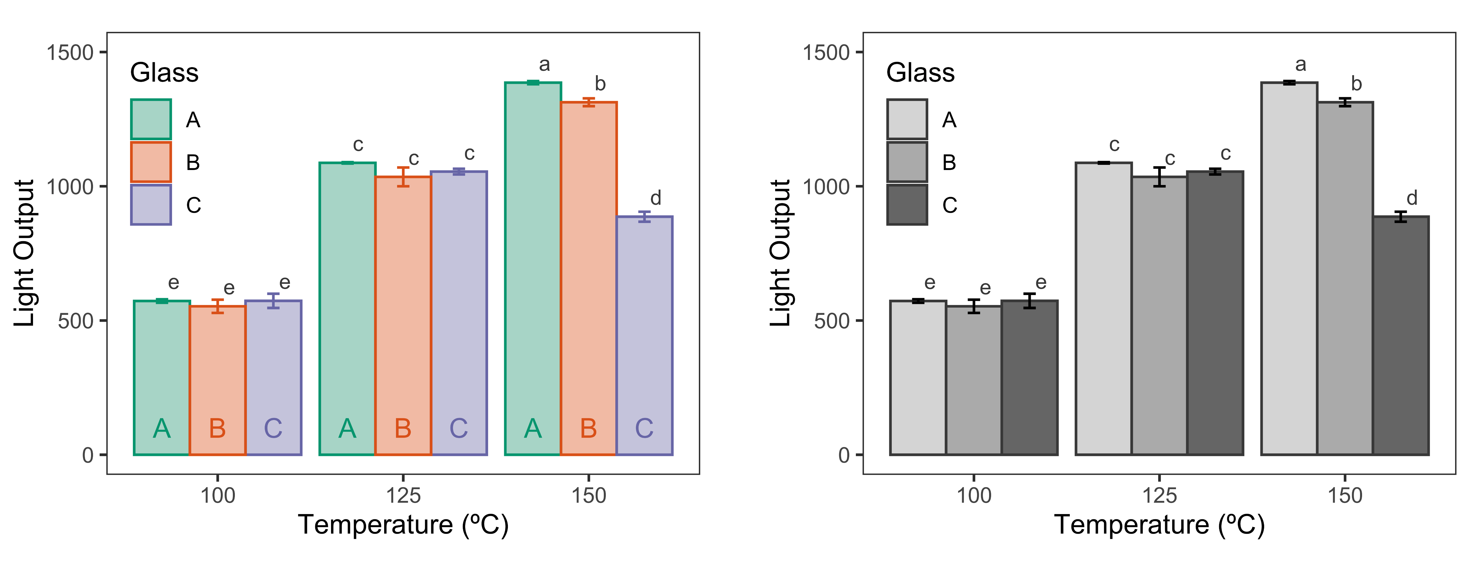
geom_text(aes(label=Glass, y = 100), position = position_dodge(0.90))
Now the plot conveys the right information even if printed in gray-scale, and it is also accessible to someone who is not able to distinguish colours.
Cleaning unwanted information in the legend
As the last adjustment, I am removing the horizontal line and the letter inside the legend boxes. They are from the geom_errorbar() and geom_text(aes(label=Glass)) functions; we need to add the argument show.legend = FALSE to both.
# coloured barplot
ggplot(data_summary, aes(x = factor(Temp), y = mean, fill = Glass, colour = Glass)) +
  geom_bar(stat = "identity", position = "dodge", alpha = 0.5)  +
  geom_errorbar(aes(ymin=mean-sd, ymax=mean+sd), position = position_dodge(0.9), width = 0.25,
                show.legend = FALSE) +
  labs(x="Temperature (˚C)", y="Light Output") +
  theme_bw() +
  theme(panel.grid.major = element_blank(), panel.grid.minor = element_blank()) +
  theme(legend.position = c(0.1, 0.75)) +
  geom_text(aes(label=Tukey), position = position_dodge(0.90), size = 3,
            vjust=-0.8, hjust=-0.5, colour = "gray25") +
  ylim(0, 1500) +
  geom_text(aes(label=Glass, y = 100), position = position_dodge(0.90), show.legend = FALSE)
Customising colours
As final customisation step, I will show how to change the colour palette using the scale_color_brewer() and scale_fill_brewer() functions to change the colours of the bar’s fill and frame, respectively. I have chosen the Dark2 palette.
# coloured barplot
ggplot(data_summary, aes(x = factor(Temp), y = mean, fill = Glass, colour = Glass)) +
  geom_bar(stat = "identity", position = "dodge", alpha = 0.5)  +
  geom_errorbar(aes(ymin=mean-sd, ymax=mean+sd), position = position_dodge(0.9), width = 0.25,
                show.legend = FALSE) +
  labs(x="Temperature (˚C)", y="Light Output") +
  theme_bw() +
  theme(panel.grid.major = element_blank(), panel.grid.minor = element_blank()) +
  theme(legend.position = c(0.1, 0.75)) +
  geom_text(aes(label=Tukey), position = position_dodge(0.90), size = 3,
            vjust=-0.8, hjust=-0.5, colour = "gray25") +
  ylim(0, 1500) +
  geom_text(aes(label=Glass, y = 100), position = position_dodge(0.90), show.legend = FALSE) +
  scale_fill_brewer(palette = "Dark2") +
  scale_color_brewer(palette = "Dark2")
This bar plot is suitable for any presentation and also for written reports. The plot shows the means, the standard deviation and the compact letter display for each treatment.
The faceplate glass labels at the base of the columns makes it possible to interpret the results even when printed in gray-scale or by a colourblind individual.
Gray-scale
The next plot is a modification of the coloured plot above, if the final presentation is to be in gray-scale.
To do it, we are using the scale_fill_grey() function for the fill. We also need to define the colours for the geom_bar() and geom_errorbar(). I have chosen gray25 for both, which is the same already used for the labels of Tukey’s test.
In this case, the glass labels at the base of the columns are not necessary since the shades of gray are clear enough to identify the results.
# gray-scale barplot
ggplot(data_summary, aes(x = factor(Temp), y = mean, fill = Glass)) +
  geom_bar(stat = "identity", position = "dodge", alpha = 0.5, colour = "gray25")  +
  geom_errorbar(aes(ymin=mean-sd, ymax=mean+sd), position = position_dodge(0.9), width = 0.25,
                show.legend = FALSE, colour = "gray25") +
  labs(x="Temperature (˚C)", y="Light Output") +
  theme_bw() +
  theme(panel.grid.major = element_blank(), panel.grid.minor = element_blank()) +
  theme(legend.position = c(0.1, 0.75)) +
  geom_text(aes(label=Tukey), position = position_dodge(0.90), size = 3,
            vjust=-0.8, hjust=-0.5, colour = "gray25") +
  ylim(0, 1500) +
  scale_fill_grey()
Saving the final plot
The final look of a specific ggplot object depends on the size and aspect ratio used. The plots shown in this tutorial were build for a figure size 4×3 inches (width x height). I suggest saving the final plot as a png file with 1000 dpi resolution as shown in the code below.
# saving the final figure
ggsave("barplot.png", width = 4, height = 3, dpi = 1000)Data source: Design and analysis of experiments / Douglas C. Montgomery. — Eighth edition↩︎
About Post Author
2 Responses
Leave a Reply
You must be logged in to post a comment.
Hi there mates, pleasant piece of writing and pleasant urging commented here, I am really enjoying by these.|
I need to to thank you for this wonderful read!! I absolutely enjoyed every little bit of it. I have you book marked to look at new stuff you post…|