One-Way ANOVA and Box Plot in R
One-Way ANOVA and Boxplot in R
ANOVA, ggplot, compact letter display, Tukey’s test
- Loading and checking the data
- Analysis of variance for one factor – One-Way ANOVA
- Tukey’s test
- Compact letter display to indicate significant differences
- Creating a table with the summarised data and the compact letter display
- Basic boxplot
- Customizing x and y titles
- Formating the overall visualisation
- Adding compact letter display from Tukey’s test
- Adding colours to the boxplots
- Boxplots coloured according to the factor (explanatory variable)
- Boxplots coloured according to the median
- Saving the final figure
In this R tutorial, you are going to learn how to:
- perform analysis of variance and Tukey’s test
- obtain the compact letter display to indicate significant differences
- build a boxplot with the results
- add the compact letter display to the boxplot
- customize the boxplot colours
- colour the boxes according to the median value.
We are going to use the results of a one-factor experiment conducted to measure and compare the effectiveness of various feed supplements on the growth rate of chickens.1 The data file (chickwts) is available in the R datasets library.
We are going to start by loading the appropriate libraries, the datasets to access the data file, the ggplot2 for the plots, multcompView to obtain the compact letter display, and the dplyr for building a table with the summarized data.
# loading the appropriate libraries
library(datasets)
library(ggplot2)
library(multcompView)
library(dplyr)
Loading and checking the data
The first step of the analysis is to load the data file. We will use the str function to check the file structure.
# loading and checking the data
str(chickwts)
## 'data.frame': 71 obs. of 2 variables:
## $ weight: num 179 160 136 227 217 168 108 124 143 140 ...
## $ feed : Factor w/ 6 levels "casein","horsebean",..: 2 2 2 2 2 2 2 2 2 2 ...The data file presents one column with the response variable (weight) and another column for the studied factor (feed). The file structure shows that we have 71 observations of 2 variables, weight is numeric, and feed is a factor.
Analysis of variance for one factor – One-Way ANOVA
The next step is to perform the analysis of variance, mostly known as ANOVA, using the aov function. The arguments are the response variable “weight” as a function of the explanatory variable “feed”. The result will be stored in an object called “anova”, and to visualise it, we need to run the function summary.
# analysis of variance
anova <- aov(weight ~ feed, data = chickwts)
summary(anova)
## Df Sum Sq Mean Sq F value Pr(>F)
## feed 5 231129 46226 15.37 5.94e-10 ***
## Residuals 65 195556 3009
## ---
## Signif. codes: 0 '***' 0.001 '**' 0.01 '*' 0.05 '.' 0.1 ' ' 1Tukey’s test
The means comparison by Tukey’s test can be run on the object resulting from the analysis of variance (anova). The result (below) is an extensive table with all pairwise comparisons and the p-value for each one of them. This data can be tricky to interpret and it is usual to use letters to indicate significant differences among the means.
# Tukey's test
tukey <- TukeyHSD(anova)
print(tukey)
## Tukey multiple comparisons of means
## 95% family-wise confidence level
##
## Fit: aov(formula = weight ~ feed, data = chickwts)
##
## $feed
## diff lwr upr p adj
## horsebean-casein -163.383333 -232.346876 -94.41979 0.0000000
## linseed-casein -104.833333 -170.587491 -39.07918 0.0002100
## meatmeal-casein -46.674242 -113.906207 20.55772 0.3324584
## soybean-casein -77.154762 -140.517054 -13.79247 0.0083653
## sunflower-casein 5.333333 -60.420825 71.08749 0.9998902
## linseed-horsebean 58.550000 -10.413543 127.51354 0.1413329
## meatmeal-horsebean 116.709091 46.335105 187.08308 0.0001062
## soybean-horsebean 86.228571 19.541684 152.91546 0.0042167
## sunflower-horsebean 168.716667 99.753124 237.68021 0.0000000
## meatmeal-linseed 58.159091 -9.072873 125.39106 0.1276965
## soybean-linseed 27.678571 -35.683721 91.04086 0.7932853
## sunflower-linseed 110.166667 44.412509 175.92082 0.0000884
## soybean-meatmeal -30.480519 -95.375109 34.41407 0.7391356
## sunflower-meatmeal 52.007576 -15.224388 119.23954 0.2206962
## sunflower-soybean 82.488095 19.125803 145.85039 0.0038845Compact letter display to indicate significant differences
The use of letters to indicate significant differences in pairwise comparisons is called compact letter display, and can simplify the visualisation and discussion of significant differences among means. We are going to use the multcompLetters4 function from the multcompView package. The arguments are the object from an aov function and the object from the TukeyHSD function.
# compact letter display
cld <- multcompLetters4(anova, tukey)
print(cld)
## $feed
## sunflower casein meatmeal soybean linseed horsebean
## "a" "a" "ab" "b" "bc" "c"Creating a table with the summarised data and the compact letter display
We are going to build a table with the mean, the third quantile and the letters for each treatment (feed). The information on this table will be used to add the letters indicating significant differences to the boxplot. As the compact letter display was generated with the means arranje in drecreasing order, we will also build the table with the means in decreasing order.
# table with factors and 3rd quantile
Tk <- group_by(chickwts, feed) %>%
  summarise(mean=mean(weight), quant = quantile(weight, probs = 0.75)) %>%
  arrange(desc(mean))

# extracting the compact letter display and adding to the Tk table
cld <- as.data.frame.list(cld$feed)
Tk$cld <- cld$Letters

print(Tk)
## # A tibble: 6 x 4
## feed mean quant cld
## <fct> <dbl> <dbl> <chr>
## 1 sunflower 329. 340. a
## 2 casein 324. 371. a
## 3 meatmeal 277. 320 ab
## 4 soybean 246. 270 b
## 5 linseed 219. 258. bc
## 6 horsebean 160. 176. cBasic boxplot
We are going to use the function ggplot to build the boxplots. The first argument is the data file, chickwts, and the second argument is the aesthetics aes, where we define the x and y variables, feed and weight. However, if we run only this code, we will have a blank plot. We also need to define the geom, and is this case, geom_boxplot() for the boxplot.
# boxplot
ggplot(chickwts, aes(feed, weight)) +
  geom_boxplot()
Customizing x and y titles
Let’s now customise the x and y titles using the function ‘labs’.
# boxplot
ggplot(chickwts, aes(feed, weight)) +
  geom_boxplot() +
  labs(x="Feed Type", y="Weight (g)")
The plot could be used as it is, but there is still some space for improvement.
Formating the overall visualisation
The next step is to change the overall theme of the plot. I have chosen the theme_bw. Additionally, I will delete the major and minor gridlines, as they are normally not used in scientific plots.
# boxplot
ggplot(chickwts, aes(feed, weight)) +
  geom_boxplot() +
  labs(x="Feed Type", y="Weight (g)") +
  theme_bw() +
  theme(panel.grid.major = element_blank(), panel.grid.minor = element_blank())
Adding compact letter display from Tukey’s test
And finally, we can add the compact letter display to the plot using the geom_text function. The label is the column cdl in the Tk file. The letters’ position is defined as the feed in the x-axis, and the third quantile (quant) as the y value.
# boxplot
ggplot(chickwts, aes(feed, weight)) +
  geom_boxplot() +
  labs(x="Feed Type", y="Weight (g)") +
  theme_bw() +
  theme(panel.grid.major = element_blank(), panel.grid.minor = element_blank()) +
  geom_text(data = Tk, aes(x = feed, y = quant, label = cld))
As we can see, the labels of the Tukey’s test were centralized on the third quantile. To relocate them up and to the right we are going to define their position in relation to this point using the arguments hjust and vjust. I am also going to decrease the size of the letters.
# boxplot
ggplot(chickwts, aes(feed, weight)) +
  geom_boxplot() +
  labs(x="Feed Type", y="Weight (g)") +
  theme_bw() +
  theme(panel.grid.major = element_blank(), panel.grid.minor = element_blank()) +
  geom_text(data = Tk, aes(x = feed, y = quant, label = cld), size = 3, vjust=-1, hjust =-1)
The result is a grey-scale boxplot suitable to be used in scientific reports and presentations.
Adding colours to the boxplots
To create a more attractive boxplot, we can add some colours. In the next example, I have defined fill = "lightblue" and color = "darkblue" for geom_boxplot and geom_text functions.
# boxplot
ggplot(chickwts, aes(feed, weight)) +
  geom_boxplot(fill = "lightblue", color = "darkblue") +
  labs(x="Feed Type", y="Weight (g)") +
  theme_bw() +
  theme(panel.grid.major = element_blank(), panel.grid.minor = element_blank()) +
  geom_text(data = Tk, aes(x = feed, y = quant, label = cld), size = 3, vjust=-1, hjust =-1, color = "darkblue")
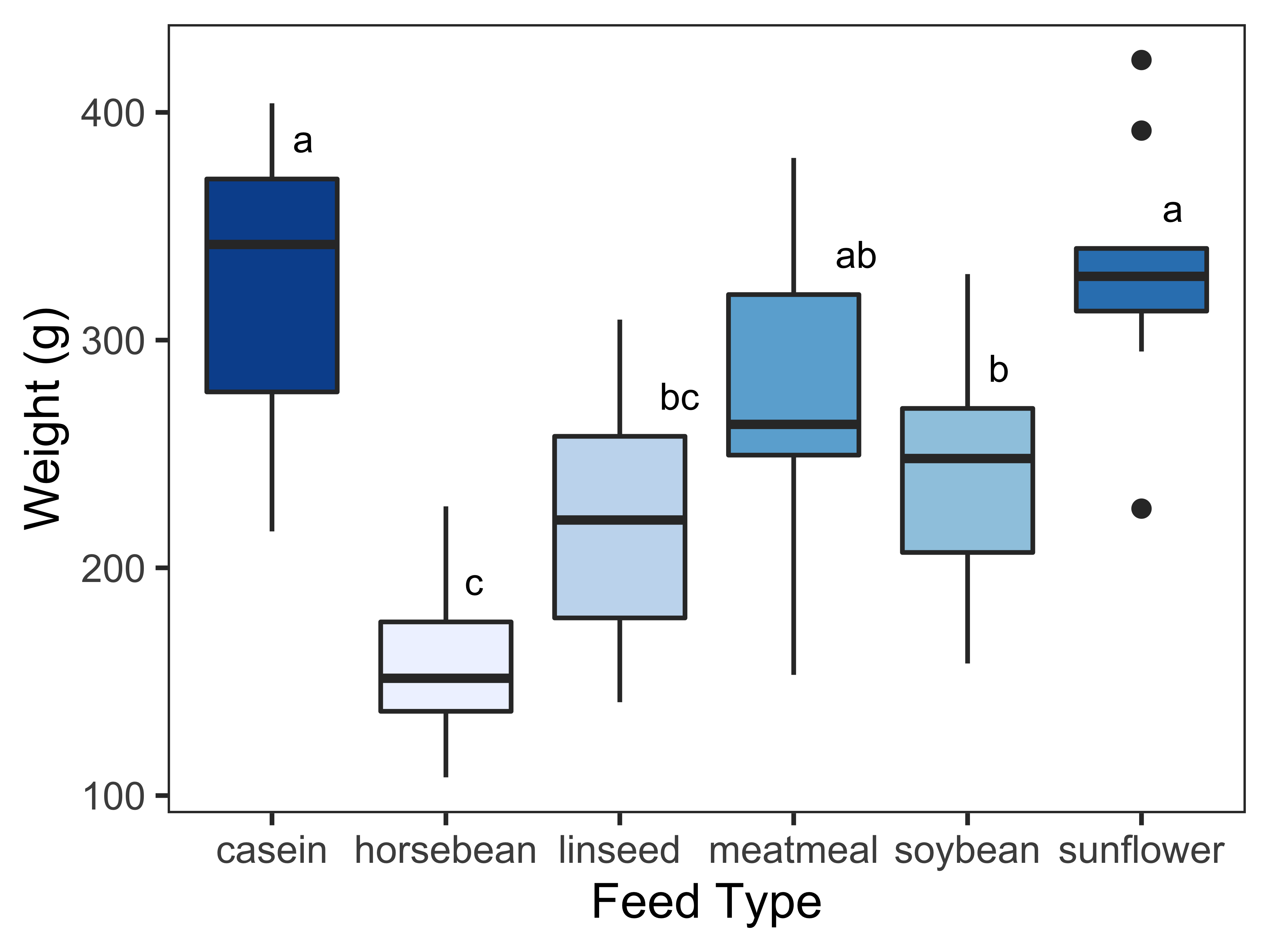
Boxplots coloured according to the factor (explanatory variable)
Another alternative is to colour the boxplots according to the factor “feed”. To do it, we need to define fill = feed in the aesthetics of the geom_boxplot() function.
# boxplot
ggplot(chickwts, aes(feed, weight)) +
  geom_boxplot(aes(fill = feed)) +
  labs(x="Feed Type", y="Weight (g)") +
  theme_bw() +
  theme(panel.grid.major = element_blank(), panel.grid.minor = element_blank()) +
  geom_text(data = Tk, aes(x = feed, y = quant, label = cld), size = 3, vjust=-1, hjust =-1)
As the legend is not necessary in this case, we can hide it using the code show.legend = FALSE in the geom_boxplot() arguments, and change the colours to a more interesting palette using the scale_fill_brewer() function. I have chosen the qualitative palette “Pastel1” for this example.
# boxplot
ggplot(chickwts, aes(feed, weight)) +
  geom_boxplot(aes(fill = feed), show.legend = FALSE) +
  labs(x="Feed Type", y="Weight (g)") +
  theme_bw() +
  theme(panel.grid.major = element_blank(), panel.grid.minor = element_blank()) +
  geom_text(data = Tk, aes(x = feed, y = quant, label = cld), size = 3, vjust=-1, hjust =-1) +
  scale_fill_brewer(palette = "Pastel1")
Boxplots coloured according to the median
Another very interesting alternative is to colour the boxplots according to the median value; we need to define fill = factor(..middle..)) in the aesthetics of the geom_boxplot() function. The argument ..middle.. returns the median value in a boxplot. I have chosen the sequential palette “PuBuGn” for this example.
# boxplot
ggplot(chickwts, aes(feed, weight)) +
  geom_boxplot(aes(fill = factor(..middle..)), show.legend = FALSE) +
  labs(x="Feed Type", y="Weight (g)") +
  theme_bw() +
  theme(panel.grid.major = element_blank(), panel.grid.minor = element_blank()) +
  geom_text(data = Tk, aes(x = feed, y = quant, label = cld), size = 3, vjust=-1, hjust =-1) +
  scale_fill_brewer(palette = "Blues")
In the resulting plot, the higher the median, the darker the colour hue in the boxplot.
Saving the final figure
The final look of a specific ggplot object depends on the size and aspect ratio used. The plots shown in this tutorial were built for a figure size 4×3 inches (width x height). I suggest saving the final plot as a png file with 1000 dpi resolution as shown in the code below.
# saving the final figure
ggsave("boxplot.png", width = 4, height = 3, dpi = 1000)
Source: Anonymous (1948) Biometrika, 35, 214. Reference: McNeil, D. R. (1977) Interactive Data Analysis. New York: Wiley.↩︎
About Post Author
11 Responses
Leave a Reply
You must be logged in to post a comment.
Multcompview and dplyr packages don’t seem to be working for me on the newest version of R studio.
Could you apply excel data file?
Yes, it is possible to import excel data files.
Hi Rosane!
Thank you very much for the tutorial!
Could the code be applied for Skott-Knott test, instead of Tukey?
Regards!
Hello Rafael,
I am not familiar with this particular test, but it is very likely that you can. There is a specific r package for the Scott-Knott clustering algorithm. If you can use it to get the table with the letters indicating the differences, the code will certainly work.
Thank you so much, could i get the data file
Hi Khalid,
The example uses a data file from the R dataset library. You just need to load it ‘library(datasets)’, and the data file “chickwts” will be available for you.
I got it, Thank you so much mam.
Thanks for sharing;
I have been struggling with this for a number of times!
Howdy are using WordPress for your blog platform? I’m new to the blog world but I’m trying to get started and set up my own. Do you need any coding knowledge to make your own blog? Any help would be really appreciated!|
Simply desire to say your article is as astounding. The clarity in your submit is simply excellent and that i can suppose you’re an expert on this subject. Fine along with your permission allow me to snatch your RSS feed to stay updated with approaching post. Thank you a million and please keep up the rewarding work.|