Pie-Donut Chart in R
Pie-Donut Chart
Combining a pie and donut chart
In this R tutorial, you are going to learn how to combine a PieDonut Chart. In PieDonut Chart, the response is the frequency of observations that are classified into the categories of two explanatory variables.
If you prefer a video-tutorial, you can watch the tutorial at the YouTube channel.
We are going to use the Titanic data set available in the R data sets library. It presents the data on the survival of passengers on the Titanic and we are going to classify it by the class.
Before starting the plot, let’s load the necessary packages. We are going to use the webr package to build the Pie-Donut chart. This library runs on the ggplot2 package, and we will also need the dplyr package for creating a table with the summarised data for the plot.
# loading the appropriate libraries
library(ggplot2)
library(webr)
library(dplyr)
The next step is to load the dataset
# loading the dataset
data <- as.data.frame(Titanic)
head(data)
## Class Sex Age Survived Freq
## 1 1st Male Child No 0
## 2 2nd Male Child No 0
## 3 3rd Male Child No 35
## 4 Crew Male Child No 0
## 5 1st Female Child No 0
## 6 2nd Female Child No 0tail(data)## Class Sex Age Survived Freq
## 27 3rd Male Adult Yes 75
## 28 Crew Male Adult Yes 192
## 29 1st Female Adult Yes 140
## 30 2nd Female Adult Yes 80
## 31 3rd Female Adult Yes 76
## 32 Crew Female Adult Yes 20The dataset presents the information on the Class, Sex, Age, Survived (Yes or No) and the frequency of the observations.
We are going to plot the information on Survived (Yes or No) in each Class. Thus, the first step is to build a table with the data.
# Building a table with the data for the plot
PD = data %>% group_by(Class, Survived) %>% summarise(n = sum(Freq))
print(PD)
## # A tibble: 8 x 3
## # Groups: Class [4]
## Class Survived n
## <fct> <fct> <dbl>
## 1 1st No 122
## 2 1st Yes 203
## 3 2nd No 167
## 4 2nd Yes 118
## 5 3rd No 528
## 6 3rd Yes 178
## 7 Crew No 673
## 8 Crew Yes 212Basic Pie-Donut chart
The Pie-Donut chart will be build using the function PieDonut() from the webr package.
The arguments are the dataset PD, the aesthetics aes() where we define the two categorical variables, Class and Survived, and the response count, n. We are also assigning a title to the chart.
# Pie-Donut chart
PieDonut(PD, aes(Class, Survived, count=n), title = "Titanic: Survival by Class")
The chart shows that 14.8% of the people were in the First Class, and 62.5% survived. In contrast, 40.2% of the people aboard were Crew, and only 24.0% survived. Similar readings can be done for second and third classes.
In this chart, the percentages of people who survived are presented in relation to the Class. Another way to show the data is with the portions of survived with regard to the total passengers.
We can do it by adding the argument ratioByGroup = FALSE.
# Pie-Donut chart
PieDonut(PD, aes(Class, Survived, count=n), title = "Titanic: Survival by Class",
         ratioByGroup = FALSE)
Now we can see the number of passengers from the First Class that survived corresponds to 9.22% of the total number of people aboard.
Another way of looking into the data is to change the pie and donut categories. In the following chart, the survival data is presented in the internal pie and the Class in the donut.
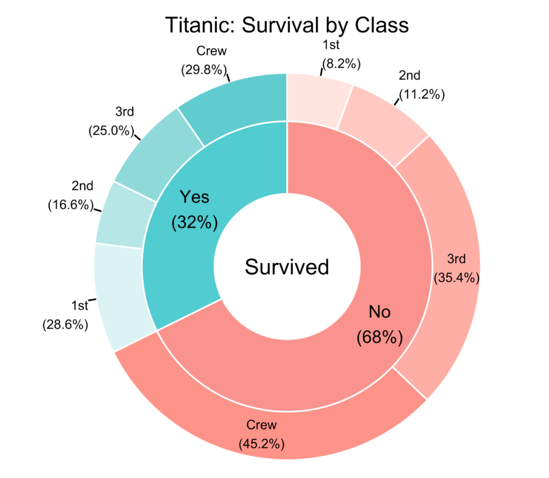
# Pie-Donut chart
PieDonut(PD, aes(Survived, Class, count=n), title = "Titanic: Survival by Class")
The chart shows that 68% of the passengers did not survive, from which 45.2% were from the Crew.
Exploding the pie
It is also possible to “explode” one or more categories. Let’s explode the Survived = Yes:
# Pie-Donut chart
PieDonut(PD, aes(Survived, Class, count=n), title = "Titanic: Survival by Class",
         explode = 2)
And it is also possible to explode the donut part of the chart:
# Pie-Donut chart
PieDonut(PD, aes(Survived, Class, count=n), title = "Titanic: Survival by Class",
         explode = 2, explodeDonut=TRUE)
## Warning: Ignoring unknown aesthetics: explode
Controlling the radius
Finally, let’s see how to control the radius of the pie and the donut with the arguments r0, r1 and r2. If not defined, the values are r0 = 0.3, r1 = 1. r2 = 1.2.
# Pie-Donut chart
PieDonut(PD, aes(Survived, Class, count=n), title = "Titanic: Survival by Class",
         r0 = 0)
PieDonut(PD, aes(Survived, Class, count=n), title = "Titanic: Survival by Class",
         r0 = 0.45, r1 = 0.9)
The charts above show how r0 and r1 arguments affect the radius the inner hole, the inner pie/donut width, and the outer donut width.
For information on the PieDonut() function, run ?PieDonut in your console window or go to https://cardiomoon.github.io/webr/reference/PieDonut.html
Video Tutorial
About Post Author
2 Responses
Leave a Reply
You must be logged in to post a comment.
Wow that was strange. I just wrote an really long comment but after I clicked submit my comment didn’t appear.
Grrrr… well I’m not writing all that over again. Anyhow, just wanted to
say excellent blog! essay writing services review
Have you ever thought about including a little bit more than just your articles?
I mean, what you say is valuable and everything. But think
of if you added some great graphics or videos to give your posts more, “pop”!
Your content is excellent but with images and videos, this blog could certainly be one of the very best
in its field. Excellent blog!